My Photography

Here's some of my photography. Enjoy.

Little White Flowers

Little White Flowers

Spider's Nest

Spider's Nest

Looks Like Plastic But Not Flower

Looks Like Plastic But Not Flower

Monday, January 19, 2009


The message that comes with this piece is a "Beauty and the Beast" type of feel. I wasn't aiming to say anything with this one, but someone pointed out to me that it reminded them of that Disney movie. Thus the title, "Roses of the Beast".
This canvas I did at home. I painted the background a light blue, then took a different shade of blue, made it really watery, and painted it onto the canvas. Then, I took a Kleenex and dabbed the wet paint. Next I pasted the flowers on. These flowers are roses I had pressed into a book in February 2008, they were a Valentine's Day gift. Then, I took some leaves and pasted them on as well. Once the glue had dried, I took the light blue paint and did another watercolor layer, then I took dark blue paint and just highlighted the edges of the roses and the leaves, also adding some lines and took some wetter dark blue paint and splattered the canvas.

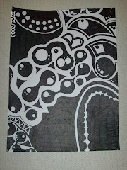
I didn't have a message to say with this piece. But I was inspired by another painting I had found on Deviant that had a similar color scheme and feel.
With this piece I used a board from the I.A. lab for my canvas and painted it with a base coat and then a coat of black. Once the black paint had dried, what I did was take gel medium, spread it in the middle of the canvas, and took a piece of metal that looks like the side of an Rubik's cube and pressed that into the gel medium. Once the gel medium was dry, I took the same piece of metal, dipped it in white paint and pressed that onto the board. Next layer I took a triangular sponge and made a pattern of red and yellow paint, then taking the piece of metal and dipping it in white again. The next stage I took black paint and painted the face and hair of a girl, then wrote the number 23 in the far bottom left corner. The number 23 is symbolic to Evan and I. I call this piece, "Magic Numbers".


The message for this painting that I was aiming for was that the environment has become poisonous for wildlife, like this fish, and they don't have the tecnology or the adaptation skills to adapt fast enough to the chemicals and garbage we're putting into their environment.

This piece I did on a canvas. I first took gel medium and spread it all over the canvas, then made the waves with a gel medium carving tool provided by Mrs. Chief, then made my fish's gills and fins and such. The once it dried I took a dark dark green a painted the entire canvas that color, the painted on the fish's body, then the gas mask. The red was a last minute decision. I think it adds the extra emphasis that my painting needed and makes the message more apparent. At the bottom is a message in Russian, this stays a secret with me. The title of this piece is "Gerdy".


This is a sketch I did in my sketchbook. It's a figure skater doing a uni-bauer (spl?). I saw a picture of this on Deviant and decided to sketch it into my sketch book. I think it turned out really well.


Tuesday, October 28, 2008

le Public d'Art Projet


This project was our first one of the school year. For this project we had to incorporate "public art" (also known as graffiti) into our art. For this, what I did was take my "Introspective Emo-Ranger" sign (the S looking shape) and add a word that started with an S (stop). I then made the lettering look public art-ish and gave it a font. Then added some weird bubble things. I decided that the background should be a type of collage and found a picture on the internet that looked like a city. I incorporated that and then came my theme, Problems in the City. The thing I liked about my project was the rough copy. There was much more detail in it then with the final copy, but since the lettering was so big and the cardboard a certain size, I couldn't use all the things I had in my rough. I think it looked better in pencil crayon then paint, but that's just me. I know the picture isn't great, the lighting is terrible and its yellow, but its the best I have.

Wednesday, September 3, 2008

Graffiti Part 2

I loved this picture because of the colors and the surealism of if. And I like how the opposite corners match eachother. Love the center of the eye.


I liked this picture because it looks so real and because that is real, people actually do sleep on park benches and curl up there until someone comes along and shoos them away. I'm pretty sure thats a butt in the top right hand corner but not too sure...

I liked this picture because it looks so real. It actually looks like a maid is liftin up a curtain to reveal a brick wall like how awesome is that? lol.


I liked this photograph because of the detail put into this like the lines. You can't really tell but there is a lot of detail in the man and the colors in the lettering are awesome and really manage to stand out.

Graffiti Part 1


This is from Etsy. I found it a while ago. I thought it was cool because they're just regular post boxes and they have similarities but they're different.


This is also from Etsy. I liked it because its so much color on what looks like an abandoned shack and the train tracks just add to the mysteriousness of the photograph. I also like how the photo is composed, how the shack is not in the dead center and you can see the trees on the right side.


I also found this on Etsy (it's a sweet site check it out). I like the detail that went into this piece and the colors. Walking down the street this would definately catch your eye lol.


Haha well I know this isn't really artistic but I lied it because it makes a good point and it's sweet because most of society see graffiti as a bad thing and when you choose to wreck private property and get in trouble you choose to lead a life of ...trouble can't really think of the word but it makes a point is what I'm trying to say.


I like this piece because it's interesting without using a lot of color. It's sureal, like a lot of graffiti, and it makes you interested in it, even though it sort of blends into the wall.

I love this! It's so simple but awesome! I'm pretty sure the paradise in the crack is a photograph but I still love. It shows how cities keep building up and taking over the paradise mother nature gave us, but we keep destroying for "progress". LOVE IT!


Friday, August 29, 2008

This is my blog.

Hey everyone. This is my blog. It's nothing too fancy. Once I put my art on here, there'll actually be something to look at. Have fun. Bye bye:)

More Photography

Here's some more photography by moi.

Sun Bathing Daisies

Sun Bathing Daisies

Wasp Attack

Wasp Attack